How to Read Candlestick Charts for Intraday Trading
How to Read Candlestick Charts for Intraday Trading
Intraday trading is a method of investing in stocks where the trader buys and sells stocks on the same day without any open positions left by the end of the day.
Hence, intraday traders try to either purchase a share at a low price and sell it higher or short-sell a share at a high price and buy it lower within the same day. This requires a good understanding of the market and relevant information that can help them make the right decisions.
In the stock market, the price of a share is determined by its demand and supply among other factors.Charts.Tools such as candlestick chart patterns offer great help to traders. We will talk about these Candlestick Charts and offer steps to help you read them.
What are Candlestick Graphs/Charts?Candlesticks are a visual representation of the size of price fluctuations. Traders use these charts to identify patterns and gauge the near-term direction of price.Composition of a Candlestick Chart This is how a candlestick chart pattern looks like:

As you can see, there are several horizontal bars or candles that form this chart. Each candle has three parts:
The Body
Upper Shadow
Lower Shadow

Also, the body is colored either Red or Green. Each candle is a representation of a time period and the data corresponds to the trades execute during that period.
A candle has four points of data:
Open – the first trade during the period specified by the candle
High – the highest traded price
Low – the lowest traded price
Close – the last trade during the period specified by the candle

Red is bearish and green is bulish candle
How to Analyse Candlestick Chart
The body of the candle represents the opening and closing price of the trading done during the period. Knowing this is important for candlestick trading. Hence, traders can see the price range of the said stock for the said period at a glance. Also, the color of the body can tell them if the stock price is rising or falling. So, if a candlestick chart for one month with each candle representing a day has more consecutive reds, then traders know that the price is falling.
Above and below the body are vertical lines called wicks or shadows that show the lows and highs of the traded price of the stock. Here is a scenario:
If the upper wick on a red candle is short, then it indicates that the stock opened near the high of the day.
On the other hand, if the upper wick on a green candle is short, then it indicates that the stock closed near the high of the day.
Hence, a candlestick graph displays the relationship between the high, low, opening, and closing price of a stock. The body can be long or short and red or green. Also, shadows can be long or short. A combination of these displays the sentiment of the market towards the said stock. These details are important to know to understand how to read a candle chart.
Candlestick Chart Patterns
Candlestick charts are an excellent way of understanding the investor sentiment and the relationship between demand and supply, bears and bulls, greed and fear, etc.
Traders must remember that while an individual candle provides sufficient information, patterns can be determined only by comparing one candle with its preceding and next candles. To benefit from them, it is important that traders understand patterns in candlestick charts.
For better understanding let’s divide the patterns into two sections:
Bullish patterns
Bearish patterns
Both patterns are essential for candlestick chart analysis.
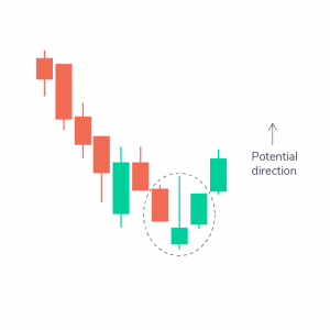
Bullish Patterns Hammer Pattern
This is a candle with a short body and a long lower wick. It is usually located at the bottom of a downward trend. It indicates that despite selling pressures, a strong buying surge pushed the prices up. If the body is green, it indicates a stronger bull market than a red body.

- Inverse Hammer Pattern___This is a candle with a short body and a long upper wick. It is usually located at the bottom of a downward trend too. It indicates buying pressure followed by selling pressure. It also indicates that buyers will soon have control.
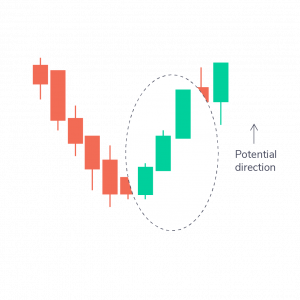
- Bullish Engulfing Pattern
This is a pattern of two candlesticks where the first candle is a short red one engulfed by a large green candle. It indicates a bullish market that pushes the price up despite opening lower than the previous day.

- Piercing Line Pattern
This is a two-candle pattern having a long red candle followed by a long green candle. Also, the closing price of the second candle must be more than half-way up the body of the first candle. This indicates strong buying pressure.


 Bearish Engulfing Pattern
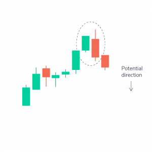


Comments
Post a Comment